Not every design on the rack deserves to be there! Why do you always reach out for the same shelf each time? What you see first on the shelf or on your screen is not an accident- it’s deliberate.
Imagine this- you switch on your phone and open a fashion app to shop. The first image that fills your screen is a model in a sharp, structured blazer, standing against a clean white background. You haven’t searched for anything yet, but you’re already drawn in. That opening shot wasn’t chosen randomly — it was selected because it stops your scroll in under a second, sets the brand’s mood, and makes you want to keep looking.
Now imagine walking into a clothing store. The moment you step through the door, a bold, floor-length coat on a mannequin stands directly in your line of sight. You didn’t plan to buy a coat today — but you stopped. You look. Maybe you even touch the fabric. That coat was placed exactly there, at exactly that height, because the brand knew you would. The colour turns heads, the silhouette is impossible to miss, and it communicates the entire season’s story in one glance.
Whether you’re shopping from your couch or walking a mall, the same invisible strategy is at work — guiding your eyes, shaping your mood, and quietly influencing what ends up in your cart or your bag. This strategy has a name: visual merchandising. And once you understand it, you’ll never shop the same way again.
Which designs get highlighted and why?
Not every design in the collection gets the spotlight. Brands run every single design through four quiet filters before deciding what gets centre stage.
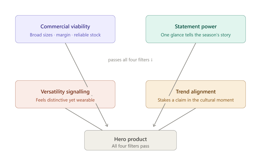
The diagram above maps the four filters converging into a single outcome — the hero product.
- The first is commercial viability — a design must have broad size ranges, strong margins, and reliable stock. A hero piece that sells out in 48 hours and vanishes is a marketing failure.
- The second is statement power — the ability to collapse an entire season’s mood into one glance. Highlighted designs don’t just look good; they say something without a caption.
- The third is versatility signalling — customers need to mentally place themselves in the piece across multiple occasions. Too niche and it alienates; too basic and it disappears.
- The fourth is trend alignment — hero designs are a brand’s answer to whatever is culturally resonant right now, staking a visible claim in the fashion conversation.
Miss even one filter, and a design gets bumped to a secondary rack, a lookbook page 4, or a limited drop — never the front window.
Placement Psychology: Eye-Level Display Techniques
Walk into any store or open any fashion app — your eyes don’t wander randomly. They follow a path that has been quietly engineered for you.
The Eye-Level Rule
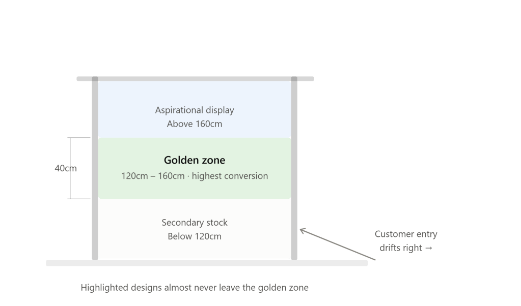
The golden zone in retail is between 120cm and 160cm from the floor — roughly chest to eye level for an average adult. Designs placed here get seen first, touched most, and purchased most often. Everything above that zone is an aspirational display; everything below is secondary stock. Brands know this so well that premium and new-season pieces almost never leave that band.
The Right-Hand Bias
Studies consistently show that shoppers entering a store instinctively drift right. This is why the highest-value, most highlighted pieces tend to anchor the right side of the store entrance. It’s not coincidence — it’s choreography.
The Three-Second Window
Whether in-store or online, a design has roughly three seconds to earn attention before a customer moves on. Highlighted pieces are chosen and positioned specifically to win that window — through colour contrast against surrounding pieces, a silhouette that reads clearly from a distance, or a mannequin pose that creates visual tension.
Breathing Room as a Signal
Crowded racks signal discount. Space signals value. Brands deliberately isolate highlighted designs — fewer items around them, more negative space — because the eye reads spaciousness as importance. Luxury stores take this to an extreme; you’ll rarely see more than two or three pieces displayed together.
Digital Eye-Level
Online, eye-level is above the fold — whatever fills the screen before a user scrolls. That space carries the same weight as a physical window display, which is why hero images and bold single-product shots always claim it first. And across both digital and physical retail, the same truth holds: placement communicates value before price does.
How Brands Select Hero Products?
A hero product is the one design a brand is willing to bet its entire season on — the piece that appears in the window, leads the campaign, and anchors every visual. Selecting it is part data, part instinct.
Brands look for three things simultaneously: a design that photographs powerfully across both editorial and e-commerce formats, one that embodies the season’s theme without needing explanation, and one that appeals broadly enough to drive real volume.
Sales history matters too. Brands track which silhouettes, colours, and fabrications have historically converted best — and new hero candidates are almost always evolutionary, not revolutionary. A small, exciting twist on something that already worked.
Finally, the hero product is often chosen not by designers alone but in a cross-functional meeting involving merchandising, marketing, and buying teams. It’s as much a business decision as a creative one.
Colour & Silhouette Hierarchy
Colour stops you first, silhouette holds you next. Brands lead with their boldest, most season-defining colour — not always their bestseller, but their loudest statement. It sets the mood instantly.
Within displays, colours are sequenced deliberately — dark to light, warm to cool — pulling the eye across the rack or page without effort.
Silhouette follows the same logic. Dramatic, structural shapes lead; basics follow. A floor-length coat or exaggerated shoulder earns the front position because it reads from a distance. Simple cuts sell through proximity to the statement piece, not through prominence of their own.
In lookbooks: hero look first, everything else after. The opening image does the emotional heavy lifting — every page simply reinforces what that first shot already made you feel.
Psychology of First Impressions in Digital Catalogs
You form a judgment about a digital catalog in under 50 milliseconds — faster than conscious thought. Brands know this, which is why every element of that first screen is obsessively controlled.
The opening image is never a product shot. It’s a feeling — a model mid-movement, a lifestyle moment, a mood that makes you want to live in that world. The product comes second; the emotion comes first.
Lighting, background colour, and model expression are all calibrated to match the brand’s target customer’s self-image. You’re not just looking at clothes — you’re being shown a version of yourself you might want to be.
Scroll behaviour is also designed. The first scroll reveal is as considered as the opening image — because the moment you scroll and something disappoints, you leave. Brands ensure the second impression is as strong as the first.
Once you understand visual merchandising, you’ll never shop the same way again — because what felt like a choice was always a cue.
 PsychWear
Leave a comment